22/05/2013
Don't become a statistic
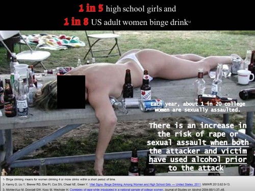
Part of my coursera assignment : create a PSA
Audience : young women
Purpose: raise awareness about the risks linked to binge drinking. Indeed most people know about alcoholism, some are aware about excessive drinking but few think about binge drinking, which is the fact of drinking 4 alcohol units for a woman in a short time (usually less than 2 hours). Most are not alcoholics but it is a risky behavior.
While most people are aware of the risks for young men, young women are a population at high risk because they are more / quicker sensitive to alcohol consequences than men.
I used following rhetorical appeals:
Ethos: 2 studies are used as references to strengthen the point.
Logos: if you drink and are inconscious you can be mishandled, the picture is illustrative. With the references, the audience can link the behavior to the risk and make up her choice!
Pathos: the picture is there to raise fear / disgust / distaste
Kairos: I would use a poster to be shown in high school / college / university just when the school starts or before integration / celebration when the parties are numerous and drinking is part of the "fun".
Picture: I tried to find a picture not so much with the party spirit sometimes linked to alcohol but with how someone can look after. I though it is more effective, it should have a more preventive effect. It should be like a warning, bring some repulsion. By the way, I found this picture on the web in several pages without any references. I used a black square to garantee a certain anonymity and stress it like a news item.
Text: I started with statistics to demonstrate that binge drinking is common even among young girls. I am not talking about alcoholism but about risky attitude. Then I introduce the risk of rape. My aim being that by reading / looking at the poster, the women don't become a statistic. I first thought of adding the line "don't become a statistic" but then thought it would be too much pathos and I prefered a mix of ethos (reference), logos (text) and pathos (picture)
Colors by using black and red I stressed the danger / risk. I underlined the fact that if both partners have drunk then the risk is even higher to show that it can be both sides
To see the picture better, clik on it.
16:14 Publié dans Drôle d'endroit pour une rencontre, Loisirs | Lien permanent | Commentaires (0)


Les commentaires sont fermés.